The States Assembly and Scrutiny websites are being updated to make them easily accessible on smartphones and tablets. This has given us an opportunity to look at both of the sites in detail and explore how they can be improved.
We’ve decided to merge the two sites on statesassembly.gov.je to make Scrutiny information easier to find. We are now going through every page giving it a new look, better functionality and improved content.
Talking to users
We started work over a year ago by talking to people about the sites. We asked what they liked, what they didn’t, and what they would like to see in future. Here is some of their feedback:
We held workshops with States members, the media, States departments and members of the public. By talking to them and observing them we started to identify small changes to the current sites which would improve the user experience, things like:
- showing more results on search landing pages
- using a larger font size
- underlining links
- showing a PDF symbol beside PDFs
- replacing the nondescript ‘more information’ link with a link called ‘Hansard, minutes and votes’
- replacing the search engine
- creating an Outlook calendar that automatically adds dates for States sittings
We wanted to make the current sites work better while we worked towards creating the updated pages for the test (beta) site, which will eventually replace the States Assembly and Scrutiny websites.
What we’ve done so far
We created a number of profiles for the types of users (known as ‘personas’) that use our websites and considered the journeys that they took to find information. We looked at how we could make those journeys simpler and improve the pages to address some of the comments about look, feel and usability.
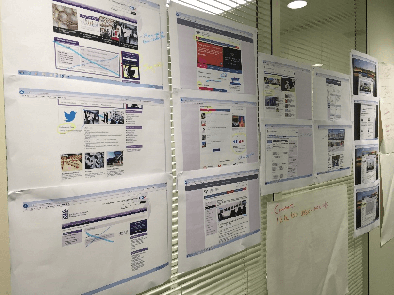
We examined the websites of other parliaments and explored what elements of those websites would work for us, what wouldn’t, and what we could incorporate into our site that they did well.
We wanted to make it easier for users to find out about the work of the States Assembly without getting lost along the way. So we have identified some key user journeys which will help the majority of our users with those top tasks:
- what meetings are happening when
- what propositions have been lodged
- what decisions have been made
- how they can contribute to a Scrutiny review
- how to contact a States member, and which States member to contact
We’ve also created wireframes, mocked-up layouts and agreed on initial designs and branding.
Sprinting
We are working on 3 weeks blocks of development work, known as sprints. This means developing, testing and releasing the new pages regularly to the beta site for further testing and feedback as we go along.
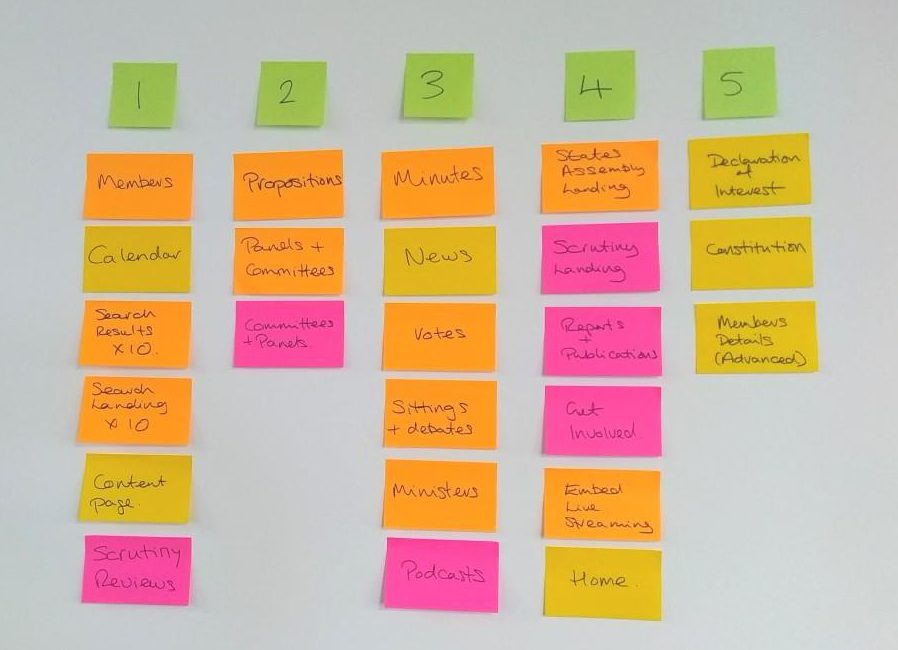
We worked out our priorities, shown below.

We have now started work on sprint one, which is due to deliver the beta site, with a basic version of the design, a directory of States members and States members’ profile pages.
Sprint two will provide new search functionality, bringing together documents from the States Assembly and Scrutiny.
Future stages will provide a general improvement in the look and feel and usability of content and landing pages, an improved meetings calendar, and an enhanced search function for finding propositions.
We’re looking forward to sharing the beta site with everyone when it is ready in November and receiving your feedback.
 blog.gov.je
